The world of reporting is essential for every marketing enthusiast aiming to maximize the impact of their marketing efforts, whether through email campaigns or other activities. Reports allow you to visualize and interpret key metrics such as open rates, click-through rates, and form submissions, helping you refine and enhance your strategies.
To fully leverage the power of reporting in Eloqua, the key feature to focus on is Insight. With the appropriate permissions—specifically, the Analyzer license—Insight provides numerous valuable benefits.
Here are 7 tips for effectively using Eloqua Insight’s capabilities to shape your data and help you create powerful reporting dashboards.
1. Pick the right Subject Area
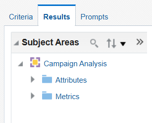
No matter how extensive your report is, start with the basics. Carefully select the Subject Area for your analysis, as this choice determines the information you can include and cannot be changed later. For example, to analyze campaign trends, choose a campaign-related Subject Area like Campaign Analysis.
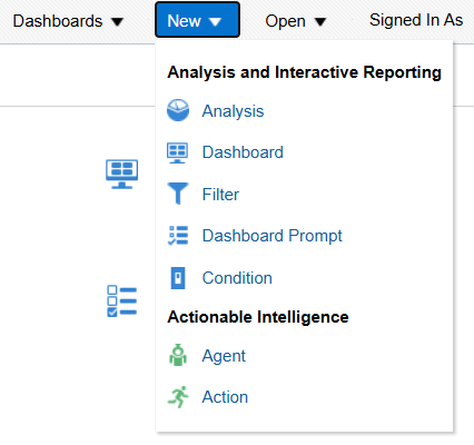
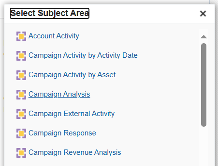
2. Organize your data so it accurately reflects your purpose
As you prepare your report, keep only the useful data, and organize it in the desired order. This makes the data more comprehensible and helps you find what you need faster. Apply filters to exclude unnecessary information and sort your columns for better organization. To achieve this, follow these steps:
· Access the report, click on the gear icon next to the column that you want sorted or filtered, then click on Sort to display the data as per your need.
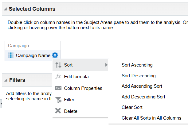
· Click on Filter and choose what data you want to leave out. For example, if you’re doing a report on Campaign Analysis, you might want to exclude campaign names that include values like “test” or “deleted.”
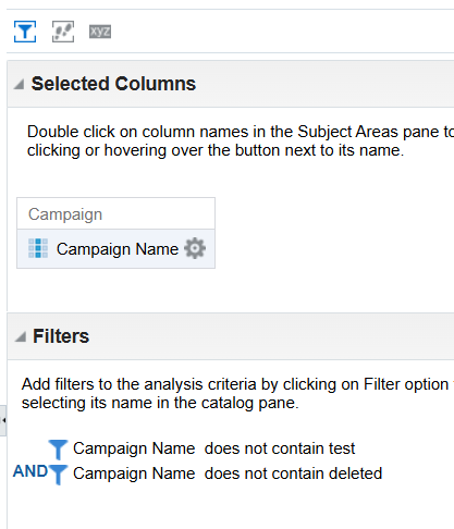
3. Make your reports more interactive
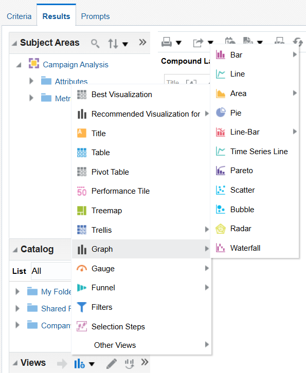
While standard tabular reports provide a broad view of your data, they can be narrowed down for a more focused and meaningful presentation. For instance, using a graph view adds visual appeal, highlights key data without overwhelming the viewer, and is ideal for client presentations.
· To add a graph view to your analysis, switch to the Results page of the report
· Scroll down to the Views section, and pick the Graph view that best suits your need
· Alternatively, you can opt for a Pivot Table view, for a more structured approach of your data.
4. Make your data easy to read
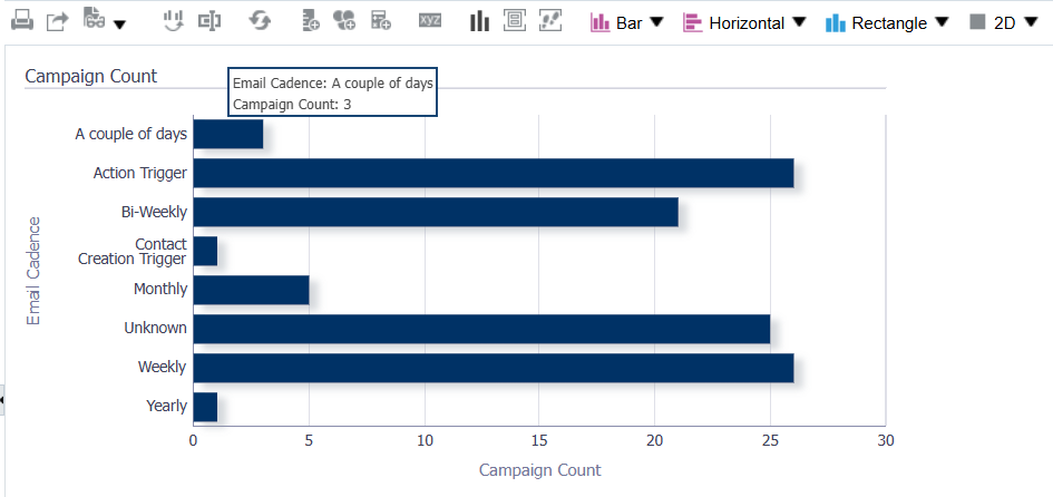
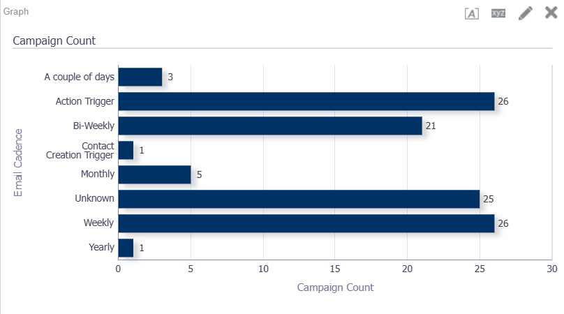
To enhance readability, consider adding labels to your graphs. By default, specific quantities of information may require hovering over data points to view details, as illustrated below:
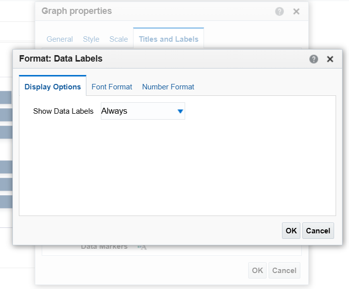
How to edit your graph to display data points:
· Click on the View Properties button
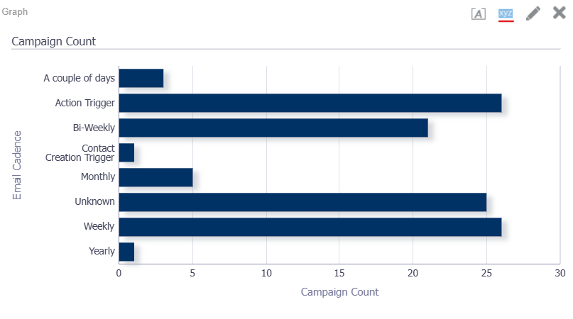
· Go to the Titles and Labels tab
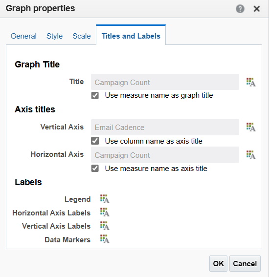
· Go to Labels > Data Markers and save your settings as show below:
5. Format your columns using SQL
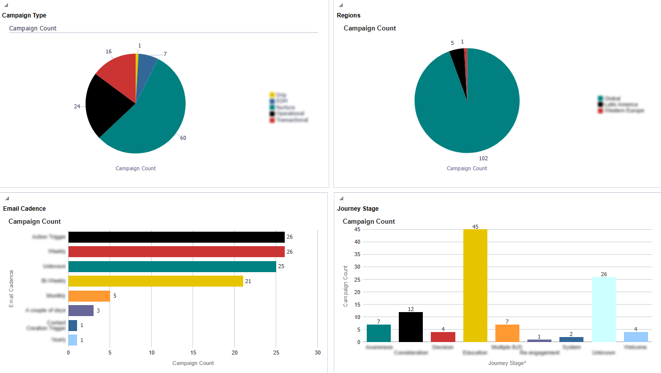
In the charts above, you'll notice a category named 'Unknown,' used to represent blank values. This naming convention helps maintain data integrity and a professional appearance. Unnamed values can be adjusted to more descriptive labels such as Blank, NA, or Unknown, ensuring your report remains clear and organized.
This can be achieved by formatting columns using SQL formulas:
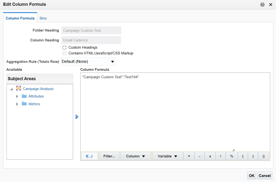
· Go back to your report's Criteria tab, click the gear icon next to the column you wish to format, then click on Edit formula.
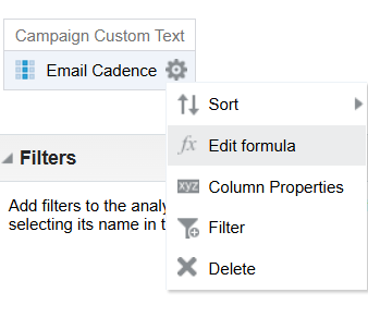
· Next, click on the Insert Function button. You will see that there are many formulas available for formatting your columns.
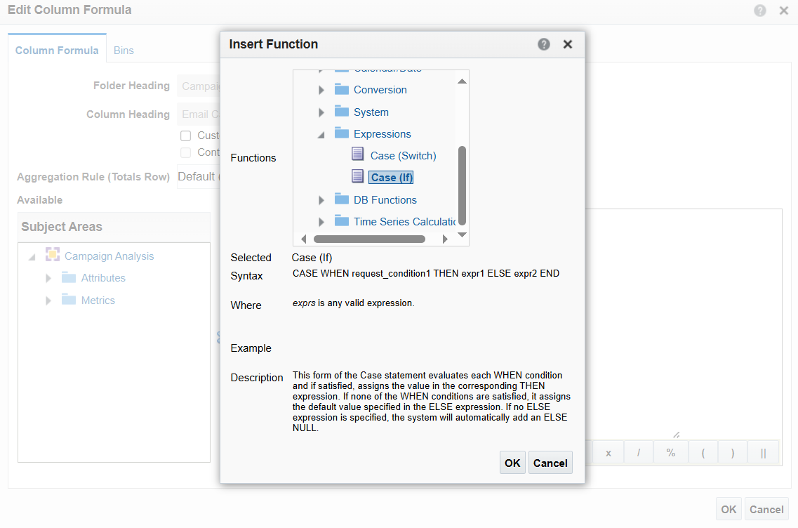
· Next, expand the Expressions sub-folder and click on the Case (If) function. Each formula comes with a description explaining its function, making it easy to navigate and use them even if you’re not proficient in SQL.
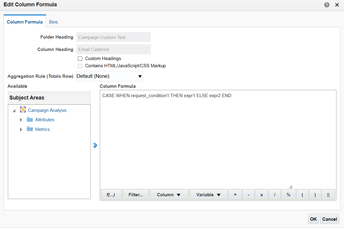
· Notice how, after you click Ok, the syntax of the formula is being displayed and what remains is for you to define the rest of the parameters.
· The above formula will display null data in this column as ‘Unknown.’ Note that the formula does not add an extra layer to your existing column; it formats it from scratch. This means you must account for all existing values in the column, not just the ones you need to modify. The full formula will look like this:
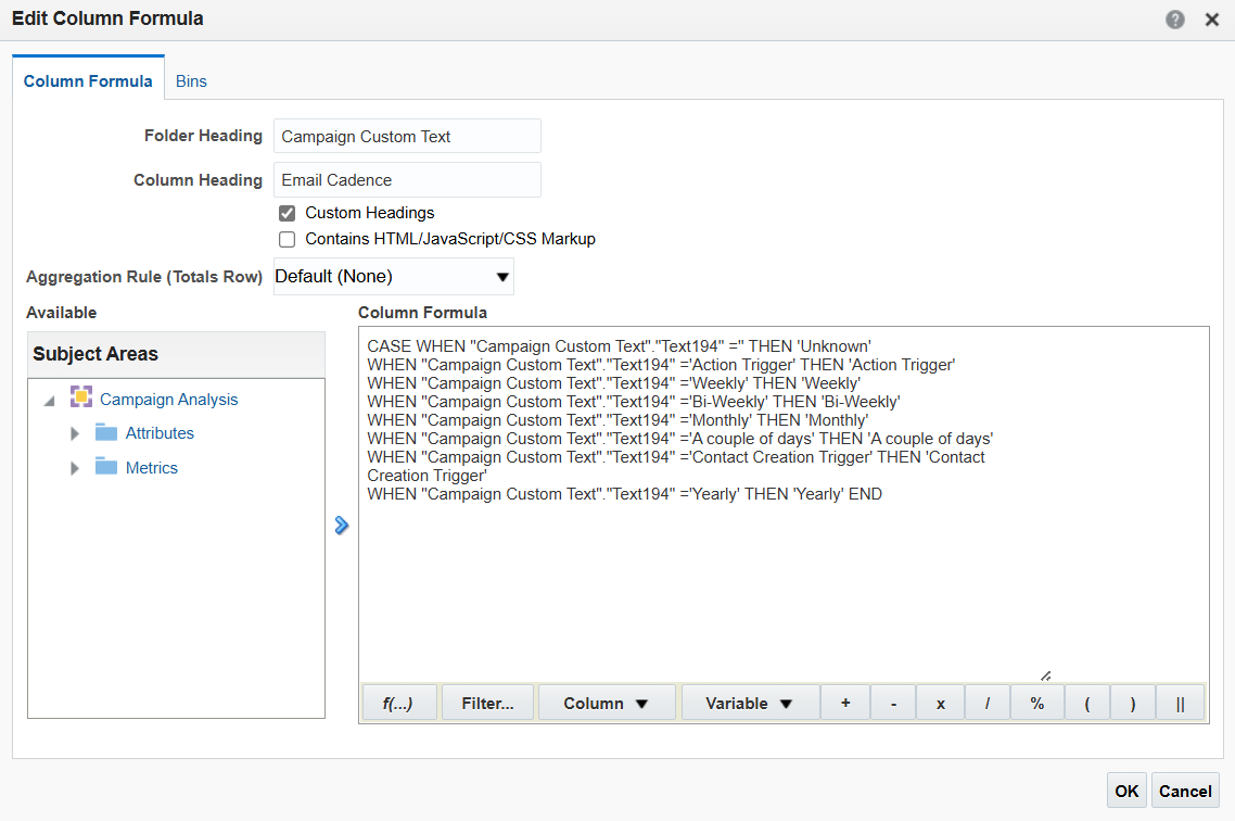
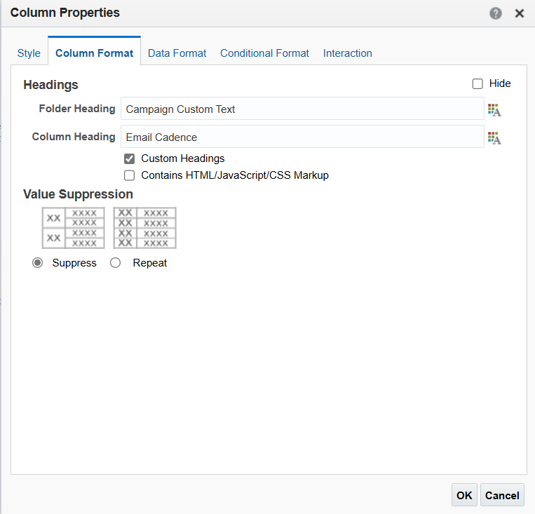
· One last thing to look after is the column header: after applying this formula, the header will take it as a name.

· To change it back to its original state, go to Column Properties, Column Format, and apply the below.
6. Bring more color to your graphs
As shown above, the default graph colors may not always be ideal. Fortunately, you can customize graph colors to your preference.
· Access the Style tab on the Properties window, then Style and Conditional Formatting
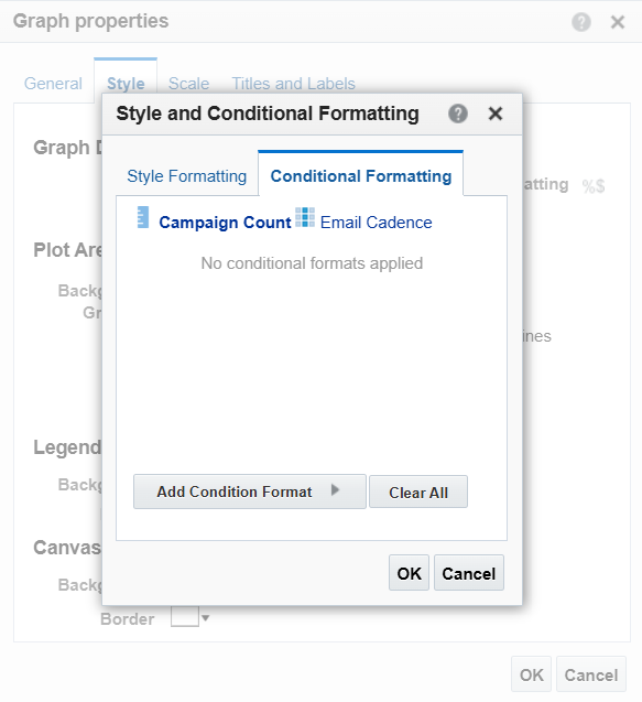
By doing so, you can have all your graphs using the same color pattern, which will make your dashboard look cohesive. Personalize your graphs using your own brand colors or use colour palette generator tools to explore this area.
7. Add prompts to your dashboard
Having multiple reports on a dashboard means more data to navigate through. While you may already have refined them as previously shown, adding a prompt to your dashboard will make it dynamic and will enable you to shift through your reports quickly.
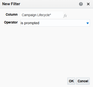
· Before you set up a prompt, you need to adjust the columns that will be part of it. Navigate to each column, filter it, and click on ‘Is prompted.’
· Build your prompt by selecting the highlighted option from the main toolbar.
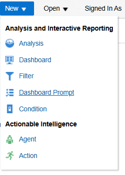
· Choose the same subject areas as you did for your reports, then click the green plus sign to add the column that you want to prompt.

· After selecting your column, you have several configuration options. In my example, I'm designing the prompt as a Choice List, allowing users to select multiple options and type in their choices.
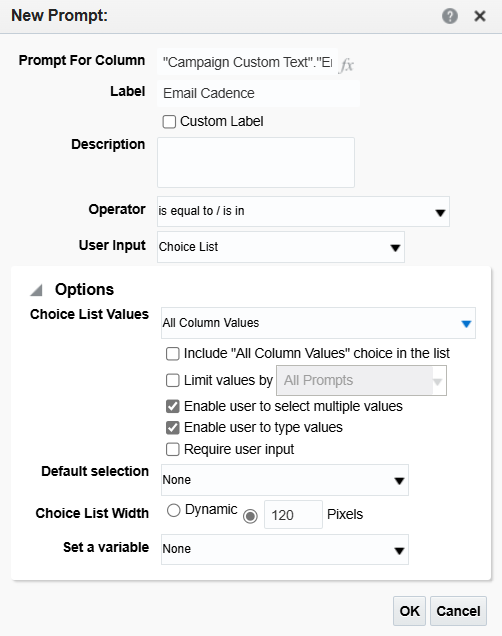
· Tip: To avoid unnecessary or unwanted values in your prompt, you can select Specific Values under Choice List values instead of the default option, and then choose the values you want to be available for selection.
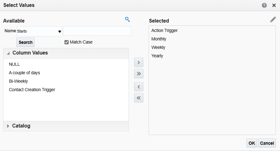
· Your prompt is now ready to be used!

Final Thoughts
Eloqua Insight offers a wide range of personalization tools that require personal exploration. Choose what suits you best to ensure your dashboards accurately express your data. Experiment with widths, heights, colors, styles, formatting, and positioning. Be creative—this is the best way to understand Insight's capabilities and learn about its features.
Explore further into reporting with Eloqua Insight by delving into our specialized articles on the subject.
If you seek expert assistance with your reporting operations, we're equipped with a wealth of knowledge to support you. Reach out to us to enhance your reporting efficiency and uncover new insights within your data.


